


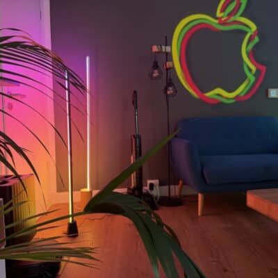
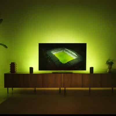
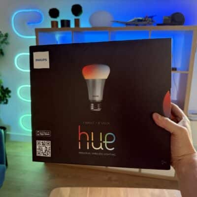


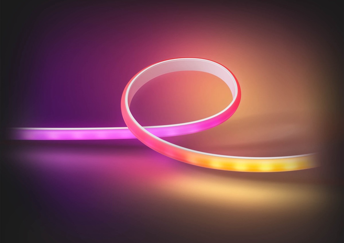
For a little more than a month now, Philips Hue has been offering the possibility to freely select three colours for gradient products and to create automatically generated colour gradients based on this. Later, depending on the product, it will be possible to select even more colours, at least according to Hue inventor George Yianni.
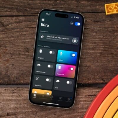
Now I have received an interesting question from a reader, which I have unfortunately not yet been able to answer concretely: “How can you actually assign the three icons in the colour selection to the corresponding segment?”
Currently, only two things are clear: The middle dot can easily be recognised as such because of the fine lines. Where the top or bottom is in a Gradient Signe and where the right and left are in an Ambiance Gradient Light Strip is not recognisable in the app.
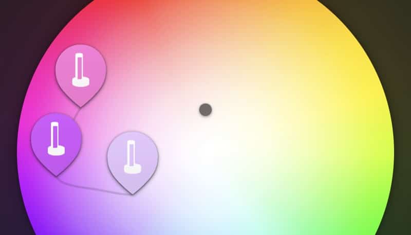
I have two ideas on how Philips Hue could improve this view:
- When tapping on an icon in the colour selector, additional information is displayed.
- The icons in the colour selection show directly which segment they represent.
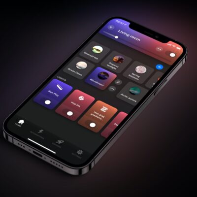
Apparently dynamic scenes cannot be automated. They can only manually activated. I hope this is fixed in a software update.