


When I took a look at the Hue app on the overcast days, something struck me as odd. The start page with the overview of the rooms seemed so empty. However, I didn’t immediately realise what exactly was missing. It was only a comment from a reader that put me on the right track.
“The information on the start page about how many lights are on in a room has also disappeared for me. It seems so empty now,” writes Yoshi under one of my articles.
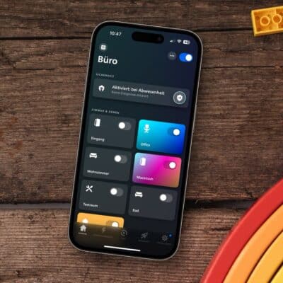
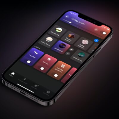
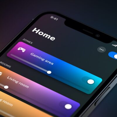
And indeed. Previously, Philips Hue displayed how many lights were switched on under the room name and above the slider. Here’s a direct comparison between the old and new view:
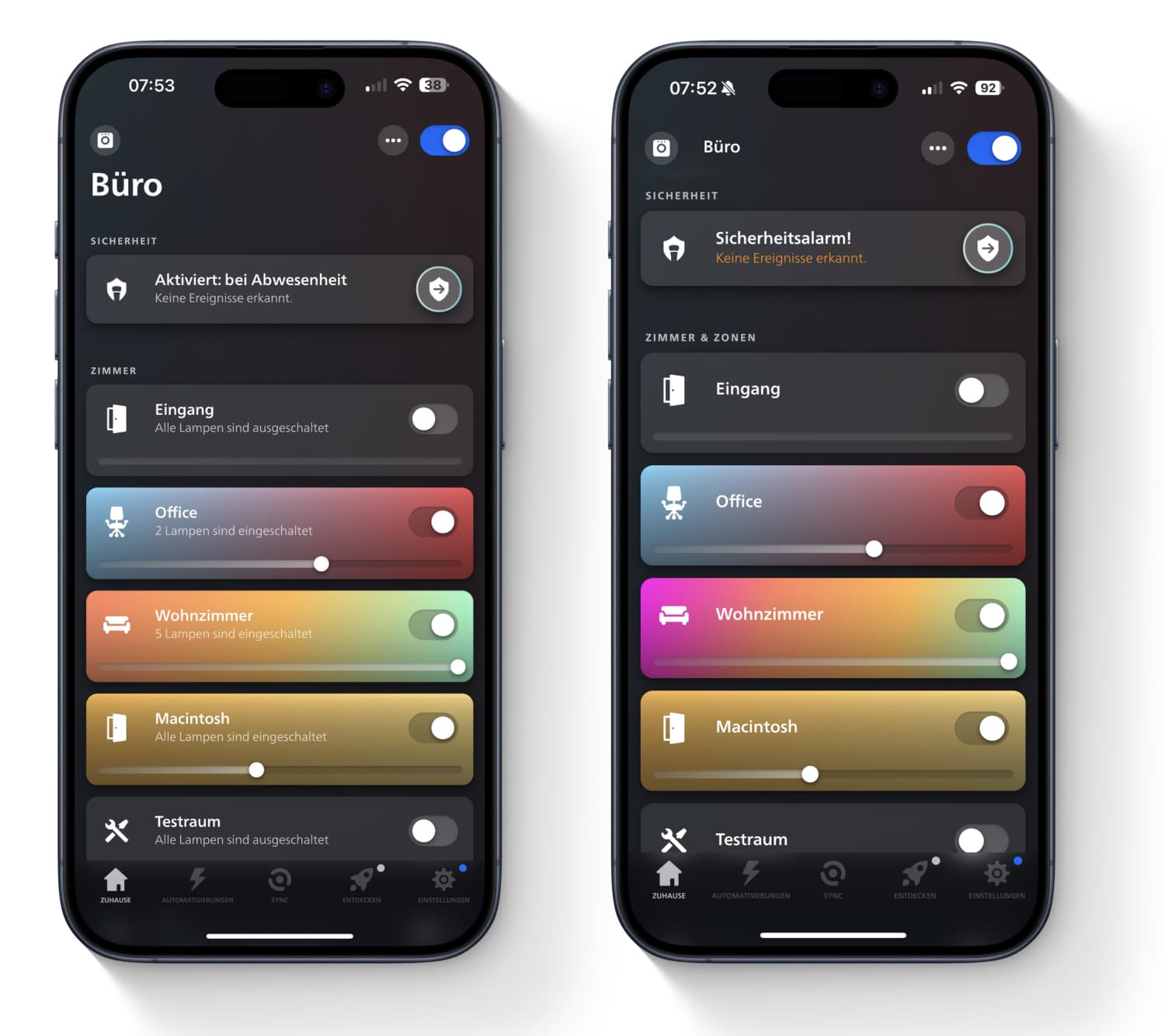
I rummaged a little in the archive. When the major update was released a few years ago, the additional information was not yet displayed – you can see this at the top of the title image. These must have been added at a later date.
Now, of course, the question is: Which view do you like better? The old version with the information about the switched-on lamps? Or do you prefer the display without additional text? Why don’t you write your opinion in the comments?


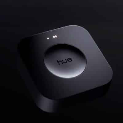
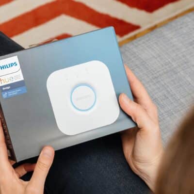
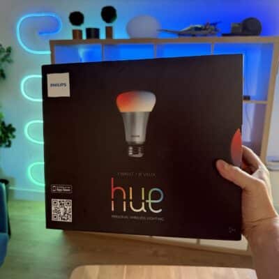
 Not a mistake, but intentional: Cleaned-up home page in the Hue app Now also in the Android version - With the introduction of version 5.12, Philips Hue has made a small change to the start page of its app, which you may have already noticed. While information on the… …
Still there on Android.
Same for me on Android14 with the latest Hue app.
I have the number of lights activated in each group on the home screen
I hope they don’t remove it on Android! I don’t want this info display taken away from us.
It’s gone in the latest app for Android released yesterday for me 🙁
The new look is OK but then please make the bars a bit less high so more rooms fit on the screen. It’s too empty now.
That’s rubbish! Hope you can change it in the settings