

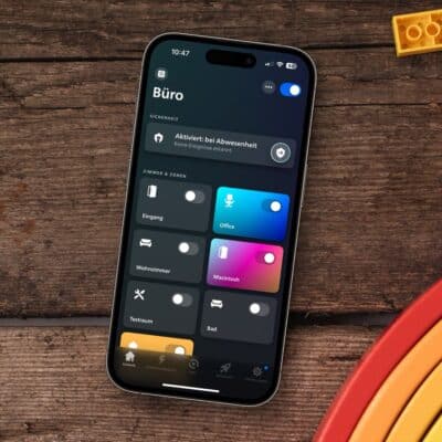


With the introduction of version 5.12, Philips Hue has made a small change to the start page of its app, which you may have already noticed. While information on the lamps that are switched on or off was previously displayed under each room name, this space is now empty.
“5 lamps are switched on” or “All lamps are switched off” was previously displayed there. After this small detail had already disappeared on the iPhone and iPad, the Android app from Philips Hue also followed with the delayed update on Monday.
In the meantime, I have received feedback from Philips Hue. They wanted to make the start page clearer and simpler and have therefore decided to remove this detail from the view. This is therefore not a mistake, but an intended change.
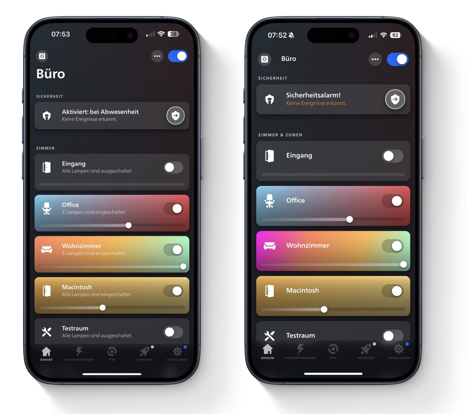
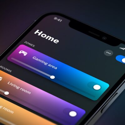
Almost a week after the change, I still stand by my opinion: with the removal of one line of text, the Home view in the Philips Hue app now simply looks far too empty. Available space on the display that now simply remains unused and fulfils no function.
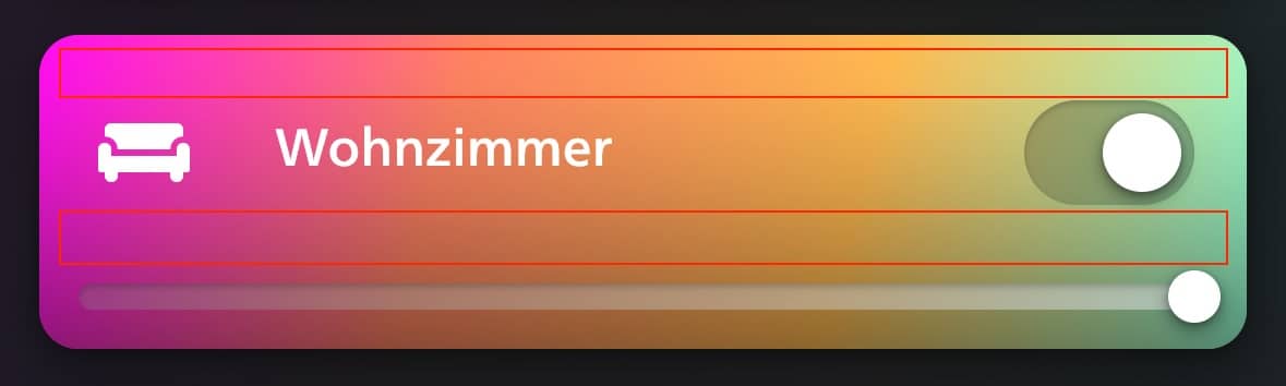
The change would have been understandable for me if Philips Hue had made the tiles of the individual rooms more compact. As you can see in the following screen, there would be plenty of space for this. At the same time, this would have the nice side effect that more rooms could be displayed on the start page at the same time. On the iPhone 15 Pro, only five rooms are directly visible after opening the app. If each tile were only 20 per cent more compact, one more room could be displayed.
Surely it’s all just a question of getting used to it. On the other hand, it seems as if this change hasn’t been thought through to the end… What do you think?


Definitely not a fan. I almost never have an entire room or zone lit anymore (a leftover habit from the extremely high electricity prices the last few years) and want to see how many lights are on to see whether I need to make an adjustment. Now I have to open each room to check this. It also looks silly with all the extra space, if the tiles were smaller I might have understood it but to only remove information and keep the same layout is stupid.
I hate it.
they may provide a home viewing option with or without…
I hate it every time some corporate “specialists” decide for all the users to remove the useful information, because they think it’s a good idea. This is an app, it should be customizable.
Exactly, it can’t be that difficult to add an option in the setting to display the information or not…
Bring back the original layout. That information and knowing how many lights are on is super useful. Don’t like the fact that data is now missing and additional swipes are needed.