Yesterday evening, Philips Hue released another update to its app – and simply failed to mention the biggest new feature in the update description. On the iPad and also on Android tablets, the room overview is now displayed with two columns again. But before we get to that, let’s take a look at what the app looked like before.
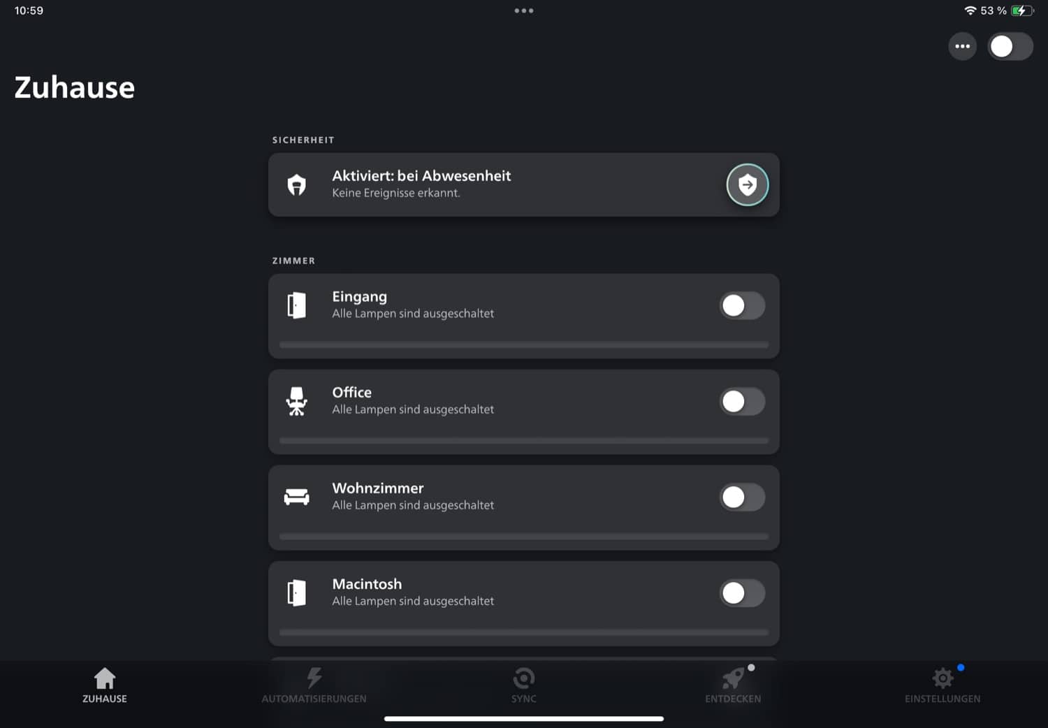
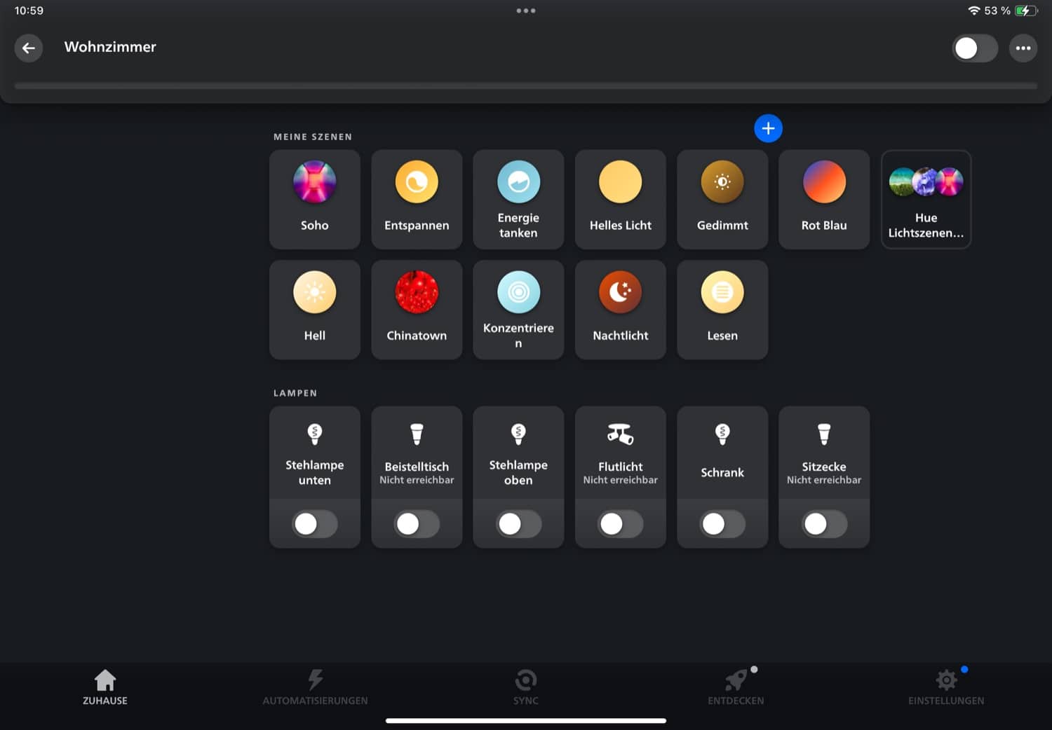
This is what the iPad app looked like before the update
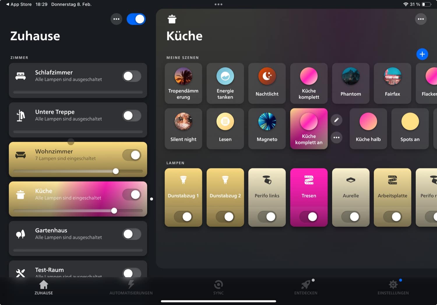
The two-column layout in Philips Hue 5.10
After the update, there are two columns. All rooms are listed in the left-hand column so that you can see at a glance where the light is switched on. The scenes and lamps of the last selected room can be seen on the right-hand side.
Which of the two designs do you like better? The old version or the new layout with the two columns? I look forward to hearing your opinion in the comments.
What else has changed with the update
With the update to version 5.10 of the Philips Hue app, further improvements have been introduced for Hue Secure. If you wish, you can deactivate notifications but still record all events when the system is armed.
The Valentine’s Day scenes have also returned. If you want to create a particularly romantic lighting mood, just take a look at the Hue light scene gallery.








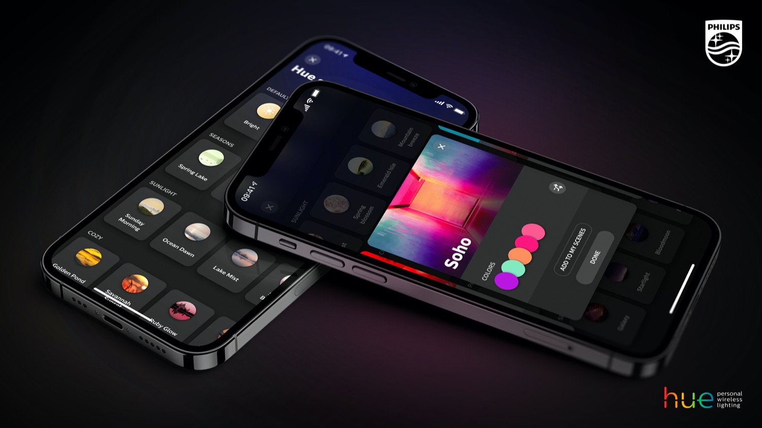

With the new update (5.10) I also noticed the new type of color picking wheel appears in some cases. I mean the third one along the existing ones – all colors hue wheel, warm to cool white gradient.
The new one seems to be based on only colors, that are part of the scene. These colors define the boundary of color subspace.
It didn’t appear to me pre 5.10, so I can’t say if it wasn there before. It also don’t appear for all scenes.
Can you send me a screenshot? Sounds interesting, but I can’t find it in my app.
Sure. Screenshot sent to post@hueblog.de.