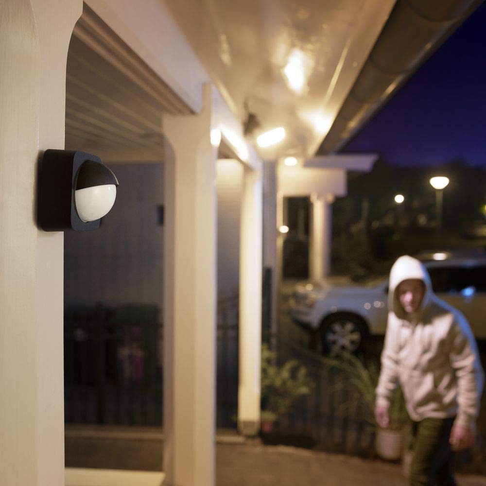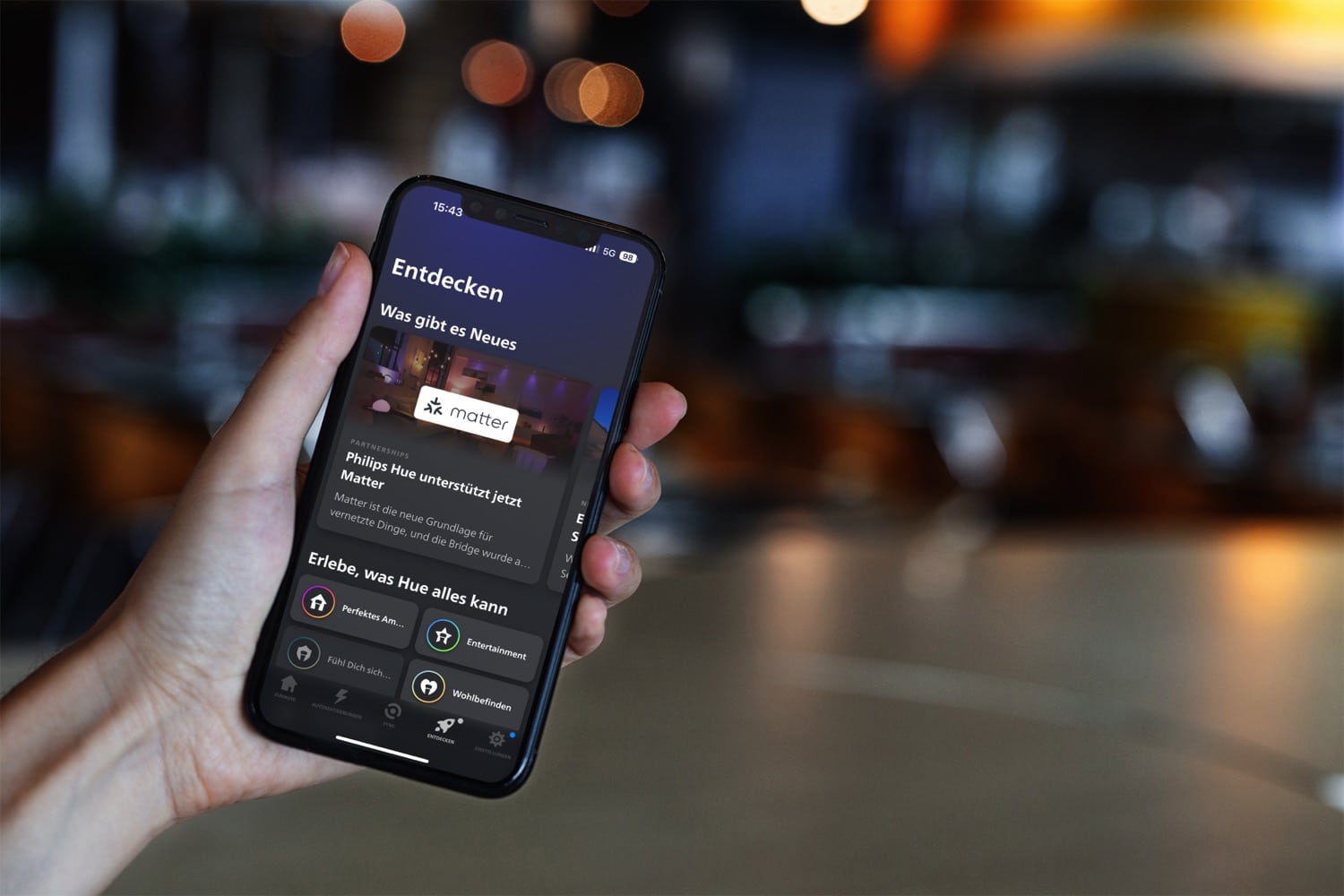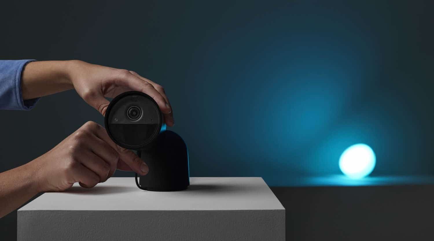

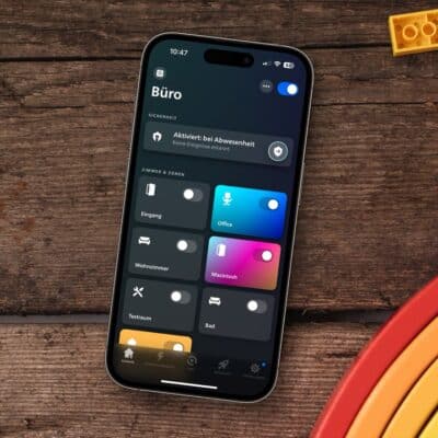

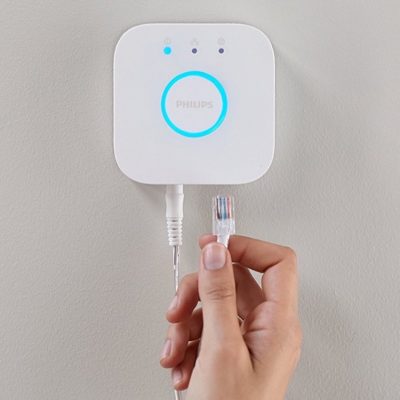
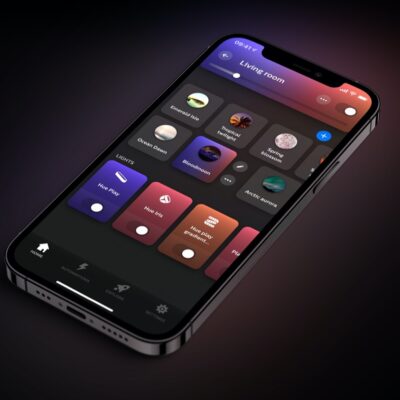
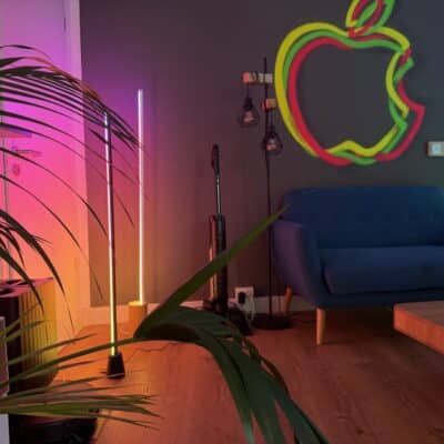
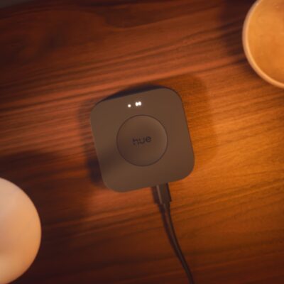


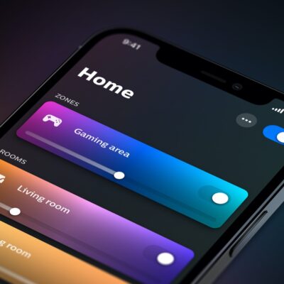
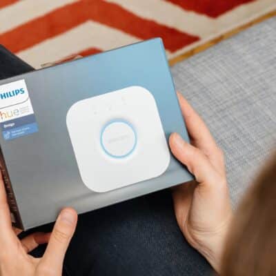


With the launch of the Philips Hue App 5.0, the Dutch manufacturer has introduced a new Security Center. In addition to the new Hue Secure cameras and Hue Secure contact sensors, the Hue motion sensors, which have been available for a long time, also get a new task there. If the system is armed, which is usually the case when you are not at home, you can receive a push message on your smartphone when a motion detector detects a movement – i.e.